Recent Posts

AtliQ team committed to making your journey smooth, collaborative, and results-driven.
Sean Johnson-Bey
CEO, COACHEDUP
From conception to bringing the product to market, the team guided us thoroughly.
Art Powell
CEO, Trinsic Technologies
Without AtliQ, we would not have made it to where we are!
Gabriel Marrero
CEO- Yosubi
I have been working with AtliQ for almost 3 years now, & the team is simply great. They understand your need & deliver what's best for your business.”
Antonio Santana
CEO at Wellness Empowered
AtliQ team is the backbone of everything we do, blessed to have them as a part of our team
Cory Hidalgo & Lisa Hidalgo
Founders, Moon Tower Tickets

We’ve worked together on a number of initiatives, and I fully recommend them to anyone looking for AI technology development.
Vishnu Enjapoori
CEO at Saroe Inc

“AtliQ delivered all priorities timely with fluid communication. They are perfect example of how smaller businesses meet larger clients.”
Abner Larrieux
President Of AL Consulting inc

“Ever since we met them, I just feel like we’ve all been growing together and we’re going to continue to grow”.
Tahir Mansoor
CEO of Black Window Tech LLC, Texas
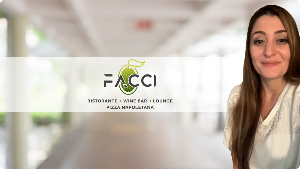
We faced difficulties with the website crashing and got back up with the help of Bhavin and his team. We’re extremely happy with our website; the customer...
Marina Hatzidakis
Founder of Facci Restorante, USA
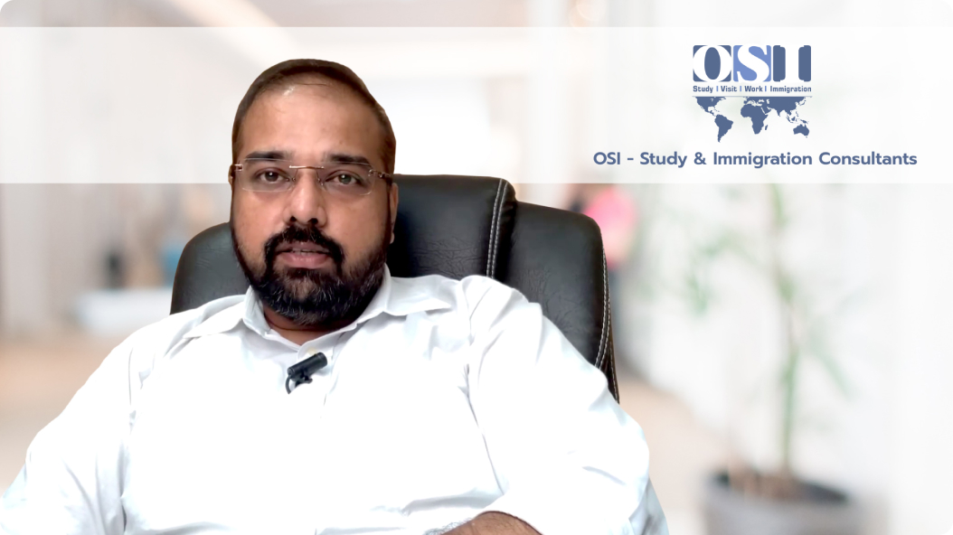
“The way they’ve initiated the entire project is awesome. I must say what they’ve built for us is beyond our expectations.”
Mr. Snehal Kothari
Founder & Director of OSI Study and Immigration Consultants